Fredman is a Finnish family-owned company that offers a wide range of products for professional kitchens. The company aims to transform commercial kitchens into more intelligent and sustainable working environments with the Chefstein® platform, an IoT digital kitchen management.
The team was tasked with redesigning the platform to improve the user experience while enabling service scalability to enhance business performance.
My responsibility
User research, prototyping and detailed visual design.
I worked in collaboration with a business designer.
Duration
19 months
The challenge
The product had several usability issues that hindered the kitchen's workflow which caused existing users to abandon the app most of the time and new users hesitated to adopt it. In addition, the restaurant industry faced challenging times in the early 2020s that required more flexibility and adaptability from both kitchen operations and its tools.
Our goal was to increase the usage of the platform among existing customers which would improve the credibility of the product among potential users. At the same time, the design needed to enable seamless integration of upcoming features and allow for scalability without compromising the overall logic and usability.
The process
In this phase, the goal was to discover problem areas and how the product should be improved. To achieve that we needed to find out how the product was being used by end-users and what contributed to their desired experience of using Chefstein. We explored the answers through several key activities: field study, user research and current state analysis.
Understanding context of use
We visited one of the restaurants and walked through the basic workflow of the kitchen staff by a kitchen expert. We learned what kind of tasks involved the use of Chefstein and how the interaction happened for the end-user.
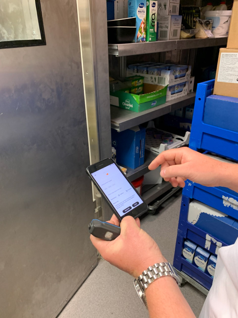
Staff is using the app to performing a task
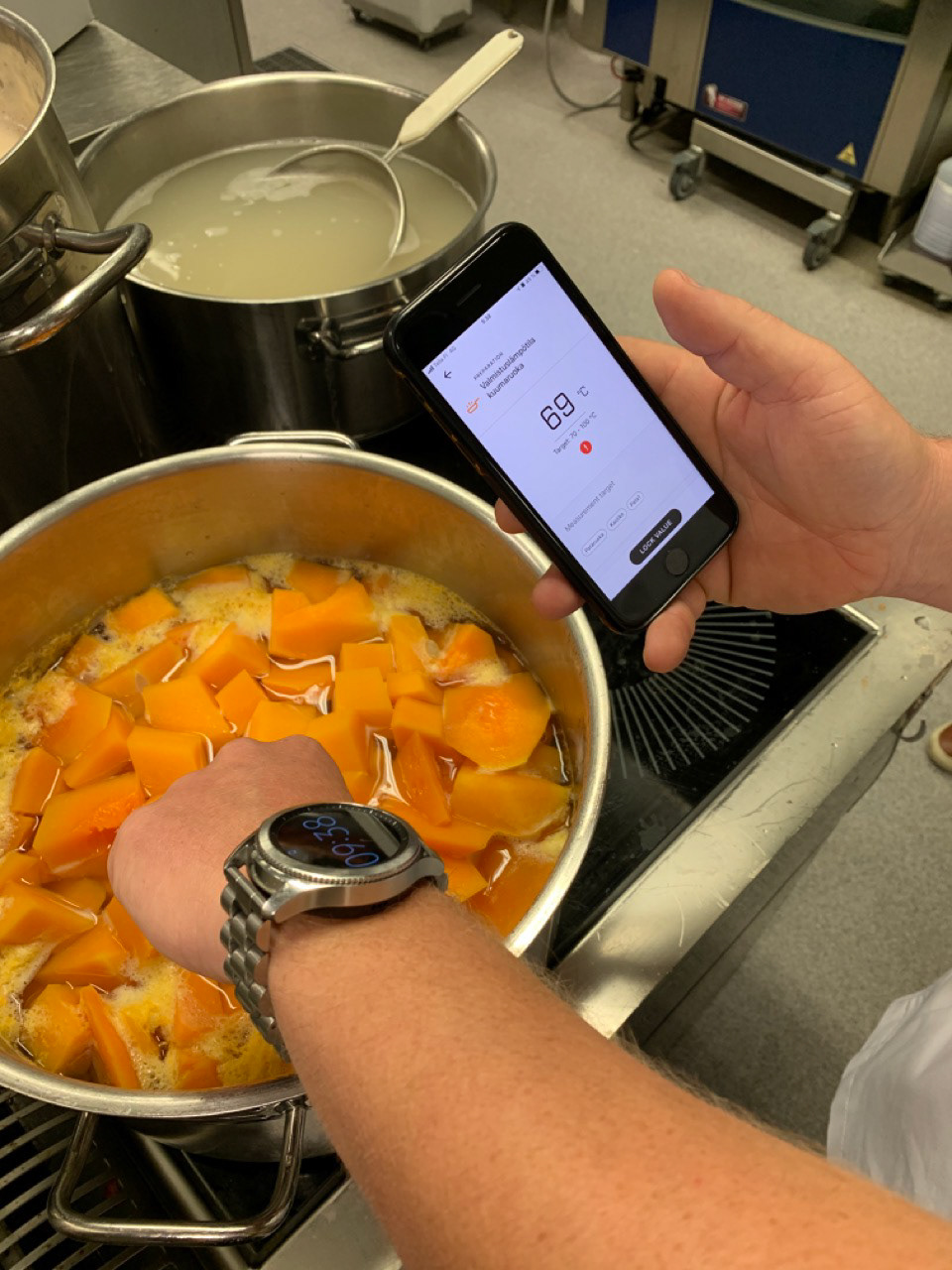
Chef is using Chefstein mobile app to performing a task
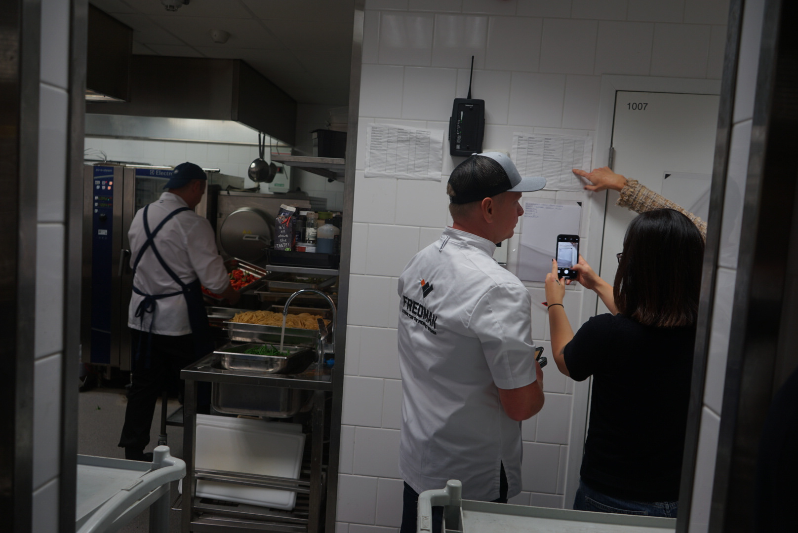
Task list is printed out and put on the wall
Understanding user pains and gains
We conducted 5 online interviews with end-users representing different kitchen setups as well as surveys that provided more in-depth insight into the field. To identify patterns, similarities, and differences in how the product was used, we shadowed users, accompanying and observing them as they worked.
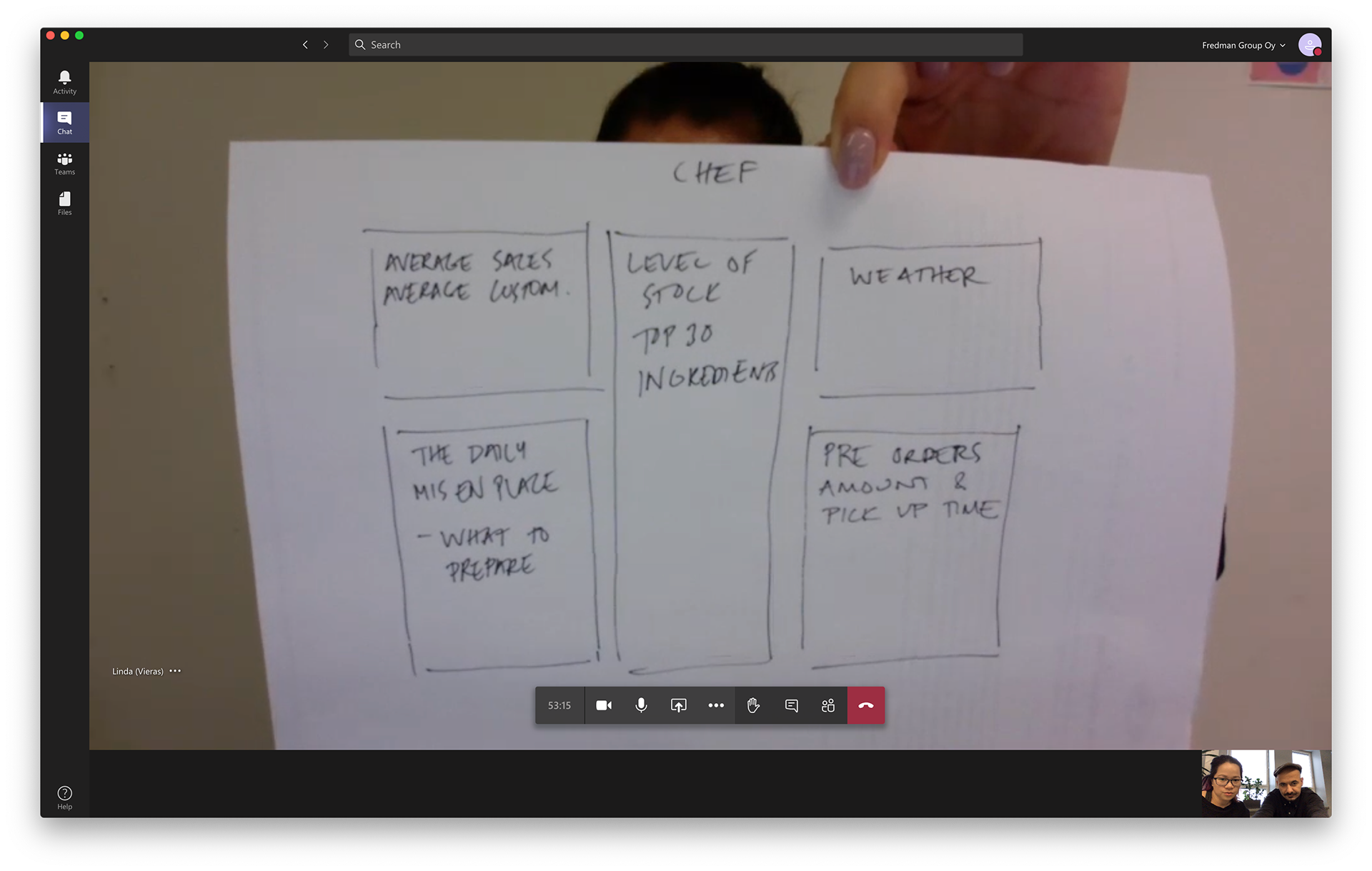
User draw their desire home view
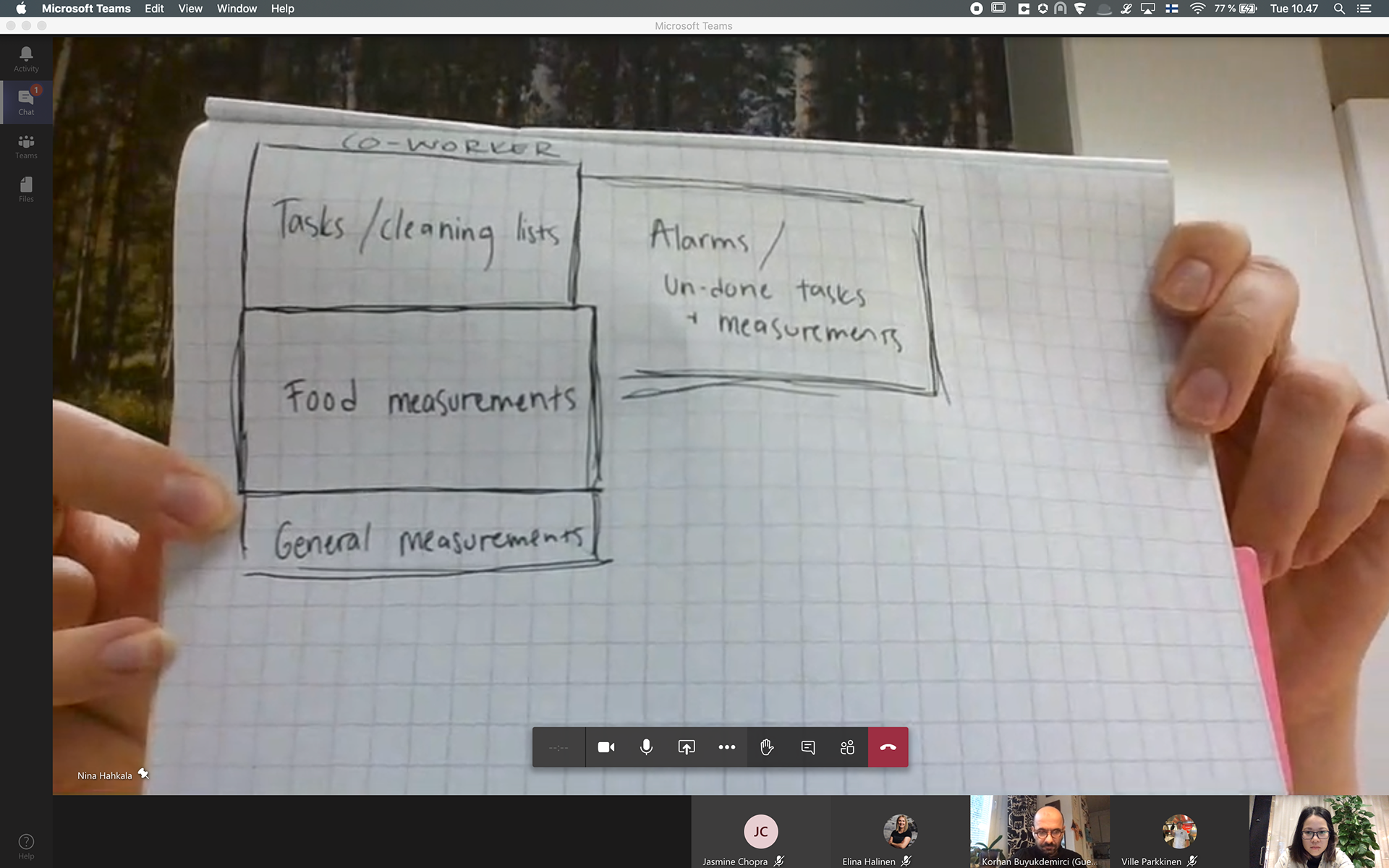
User draw their desire home view
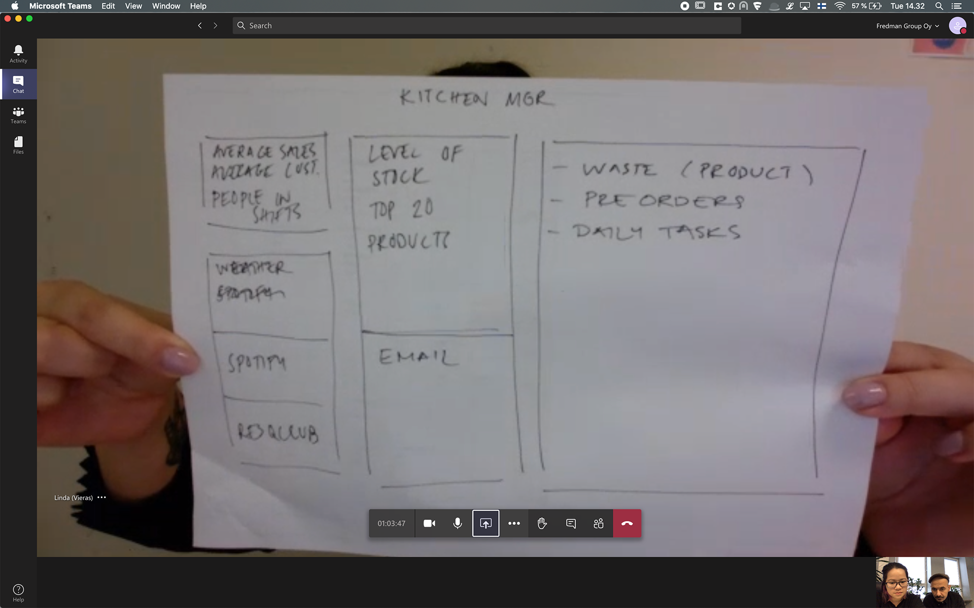
User draw their desire home view
Key findings & UX challenges
The home screen UI lacks focus on relevant information. Appliance alarms are critical for food safety but they were hidden on the home screen. The majority of screen estate was reserved for less popular features.
History data was displayed inefficiently and did not offer many filter options. This made data hard to access and became unreliable.
The appliance status list did not scale properly for different use cases resulting in lots of empty screen space. Information was scattered and hard to read. There was a lack of overview of all appliances with proper highlights of important information.
The layout was not optimal for different kitchen sizes and setups.
The restaurant's operational modal often determined the significance of appliance status and other figures to users.
Concept and redesign
Based on the insight, we were able to define the concrete steps to improve current usage:
- Making it easy to obtain relevant information.
- Reducing cognitive load when performing repetitive tasks.
- Bringing added value through a delightful experience and extensive access to data.
- Reducing cognitive load when performing repetitive tasks.
- Bringing added value through a delightful experience and extensive access to data.
The new home page with coloured task groups
Users viewed the home screen as an overview of their kitchen status. During visits, we observed that daily tasks were posted on an info board for visibility. While appliance monitoring was essential, it mattered only to managers. This showed that users prioritised actionable items—scheduled tasks, alarms, and statuses they could respond to. Interview sketches also revealed a clear pattern in task categorisation. To reduce cognitive load, we introduced colour-coded task groups, making it easier to scan the list and quickly decide what to tackle next.
Main pages on iPad
Improving user experience through effective design patterns
Introducing colour codes in modal design helped increase the user's awareness of the task they are currently engaged in
Using clear and concise feedback to guide users' focus towards primary tasks and effectively communicate errors as users proceed
Adaptive & consistent UI across devices
Elaborated data can be accessed when needed
One of the key values for managers is to ensure their kitchen follows food safety standards. Table design offers a comprehensive way of presenting and accessing data. By using extensive filter options in Completed tasks and Resolved alarms views, users can easily browse through and showcase their kitchen's history to the authority when needed.
Modern table design increases the readability and accessibility of data
Optimising important user flows
The kitchen staff relies on the mobile version to perform daily tasks and resolve alarms. It is crucial for them to accomplish these tasks effortlessly and accurately. From the home view, the new design enables critical use cases to be performed within 3 clicks.
A task can be completed quickly with
easy access to instruction
An alarm can be resolved within a few
clicks
The impact
The improvement was first implemented for the web version of the platform. The new design received positive feedback from kitchen managers through direct conversations with account managers. Customer services also reported a decrease in the number of incoming support requests. In addition, the redesigning of Chefstein helped Fredman successfully migrate several key clients from the older service.
Design evolution of main pages.
Highlights of the product usage between 2021 and 2022:
3,734
appliance sensors (fridges, freezers, dishwashers, coolers, smart waste scales) are connected to Chefstein
appliance sensors (fridges, freezers, dishwashers, coolers, smart waste scales) are connected to Chefstein
1,122
different kitchens using Chefstein
different kitchens using Chefstein
41,298
alarms were resolved
alarms were resolved
747,743
tasks executed in Chefstein
tasks executed in Chefstein
